

Reimagining a Critical Bank Feature
The days of the paper check dominating the payment world may be gone; however, the ability to deposit remains an essential part of the online banking experience. According to a 2021 report from Cornerstone Advisors, the mobile deposit remains the fourth most frequently used mobile banking function.
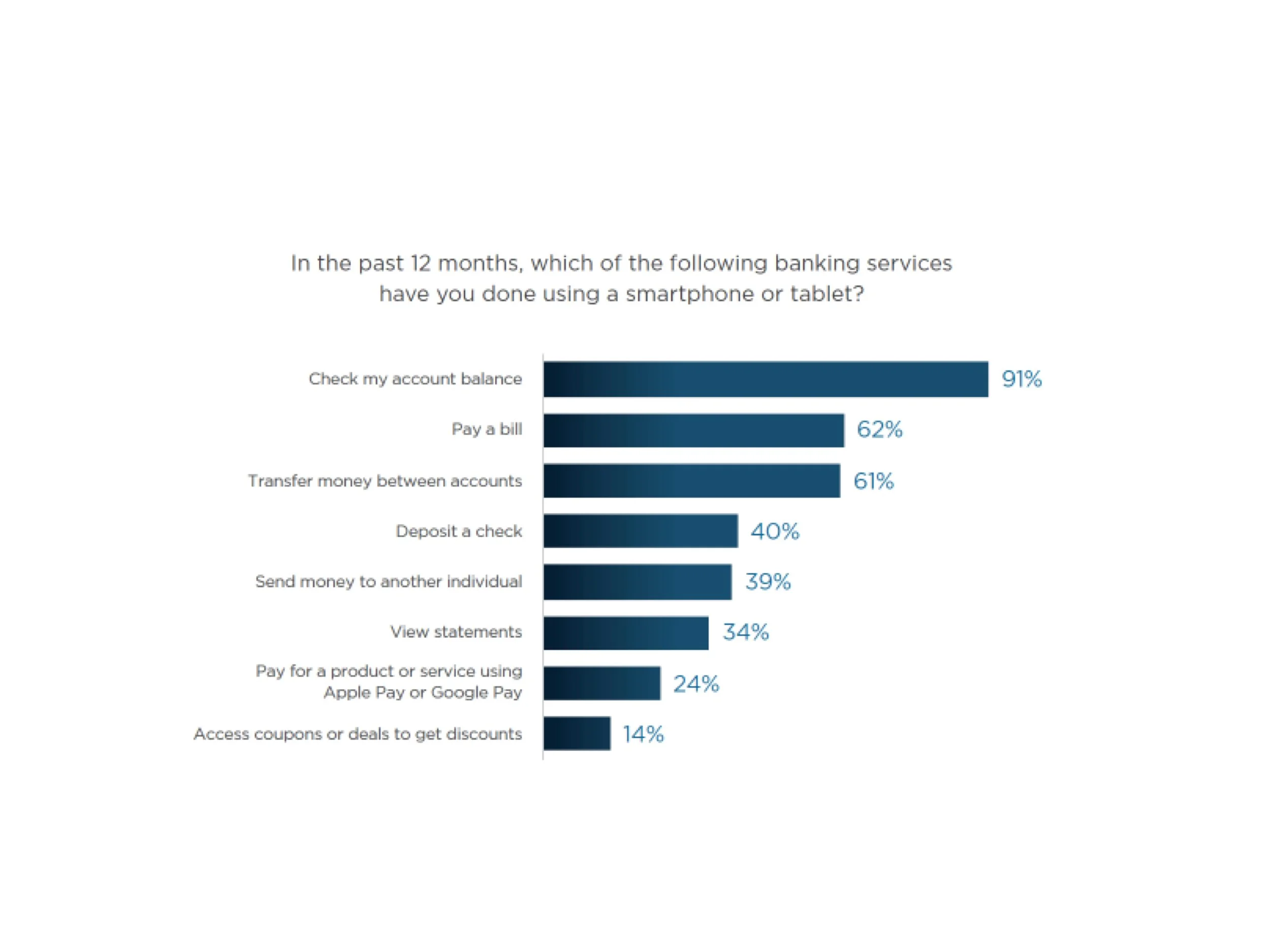
Source: Cornerstone Advisors survey of 1,968 U.S. Consumers, Q4 2020
The KeyBank Customer
While younger and more tech-savvy customers may opt for payment options such as P2P services (Venmo, PayPal, etc.) and digital wallets, paper checks are still in use, primarily by adults over the age of 55; a large portion of KeyBank’s customers base.

The Need for an Upgrade
Because the KeyBank mobile check deposit feature was operating on older technology that would no longer be supported in the future, it needed upgrading.
The product team approached me to use this time of technology upgrades to update the interface to match the current design system and visual language. I, however, saw this as an opportunity to evaluate the current process and look for areas to improve the overall user experience rather than just updating visuals.
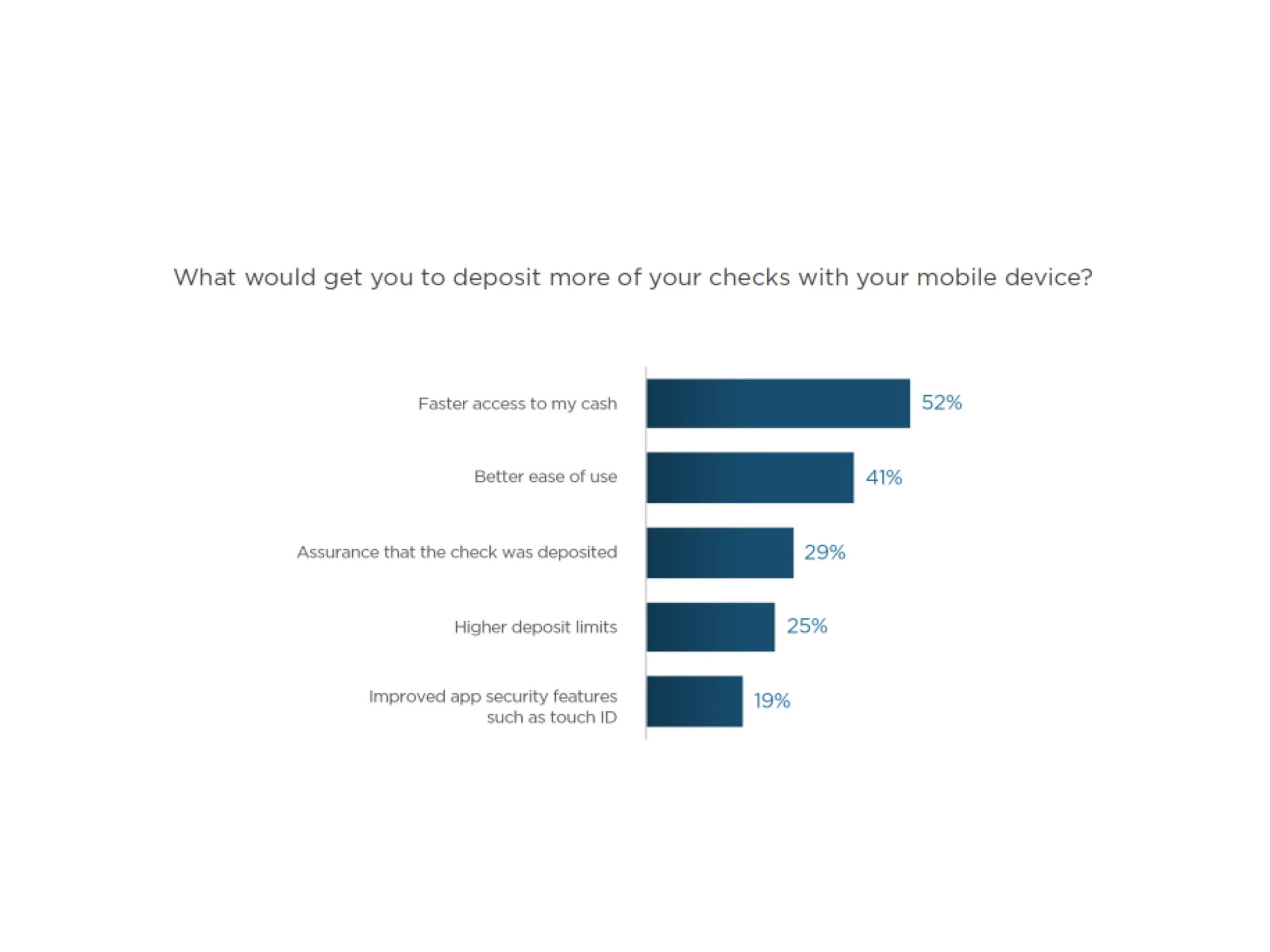
Source: Cornerstone Advisors survey of 1,968 U.S. Consumers, Q4 2020
The Discovery
Literature Review
I began my work on the project by reviewing the Cornerstone Advisors 2020 and 2021 Mobile Deposit Benchmark Reports. These reports focus on the customer experience at twenty of the largest U.S. retail banks and credit unions.
Heuristic Evaluation
Next, I took a deep look at the current remote deposit experience at KeyBank making notes of where I could implement UX improvements to create the best possible experience and make information clear for our customers.
Issues with mobile deposit:
Better ease of use
Lack of information around limits and availability
Low limits. Customers want to see these increased (based on feedback).
Timely availability
Assurance that they deposited a check
Competitor Analysis
By understanding how others in the industry handle remote deposits, I could strategically design a solution to create a superior product.
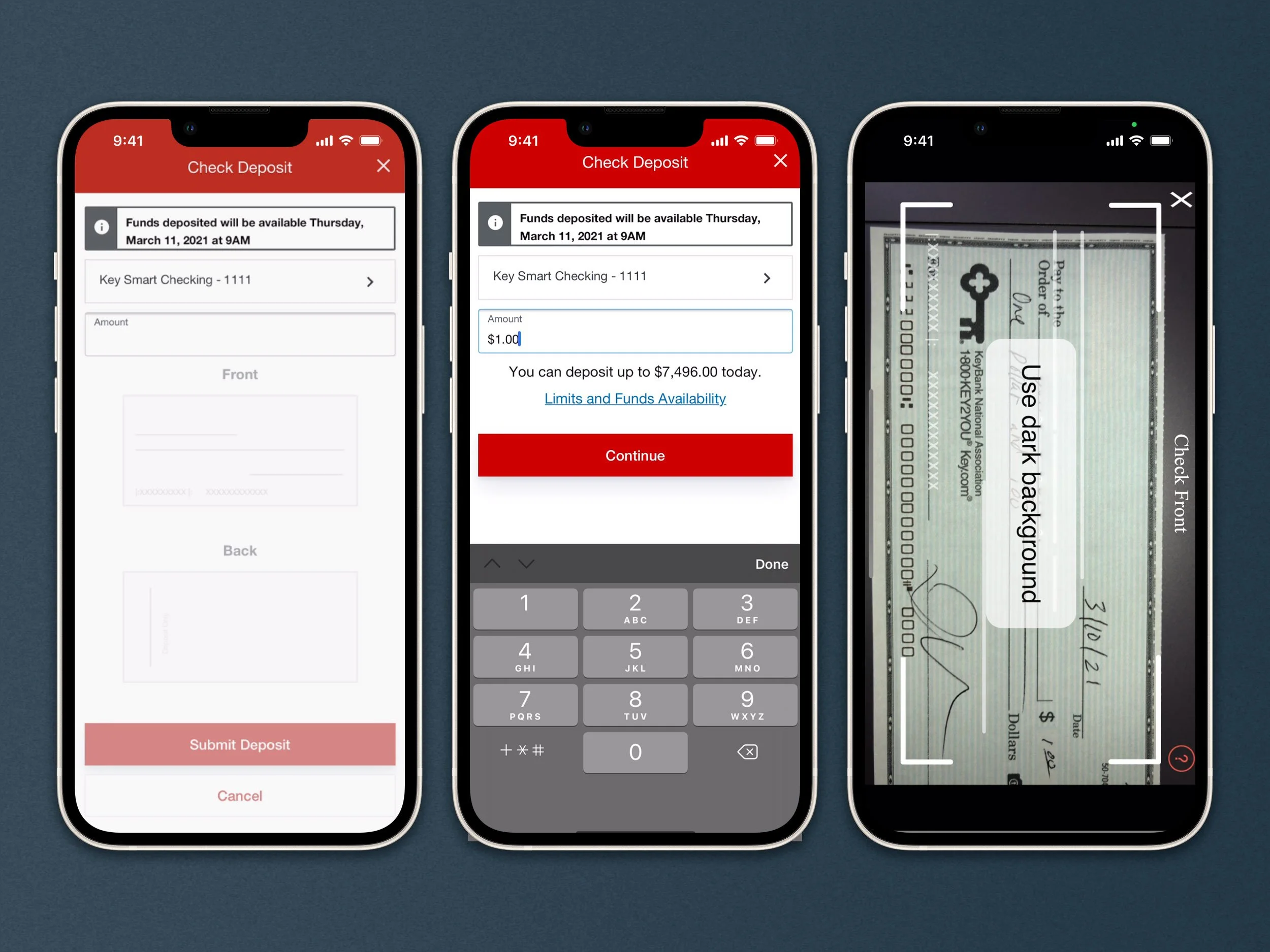
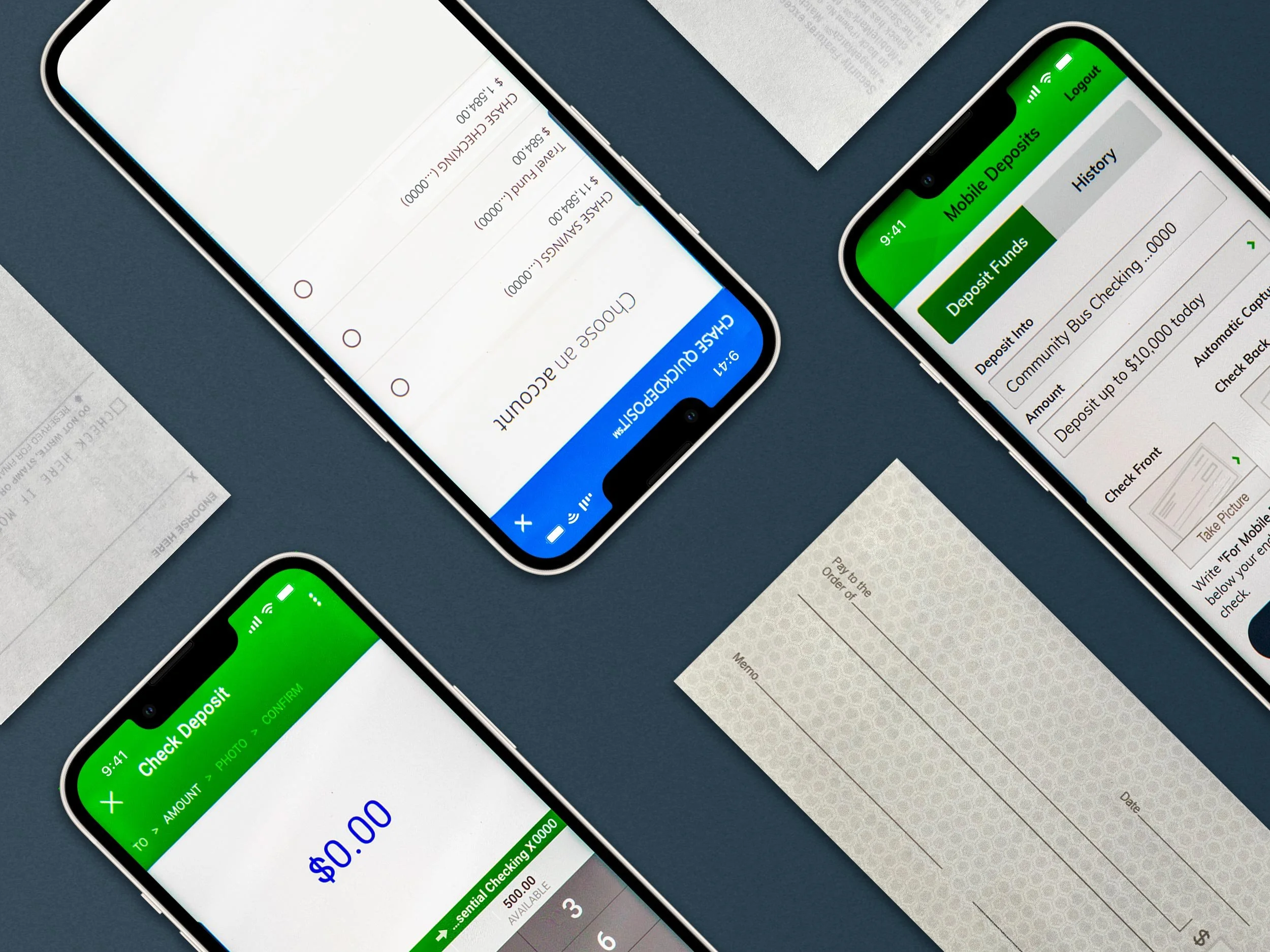
Limits and Funds is currently only shown when the user is in the “Amount” field.
Analysis & Strategy
I concluded that there is a need for transparency and reassurance. The process needs to be easily accessible, understandable, and feel secure in the form of policies and how we convey confidence.
Reframing the problem
How might we give the user vital information related to their deposit?
How might we create moments of delight and reassure the user that everything has worked as intended?

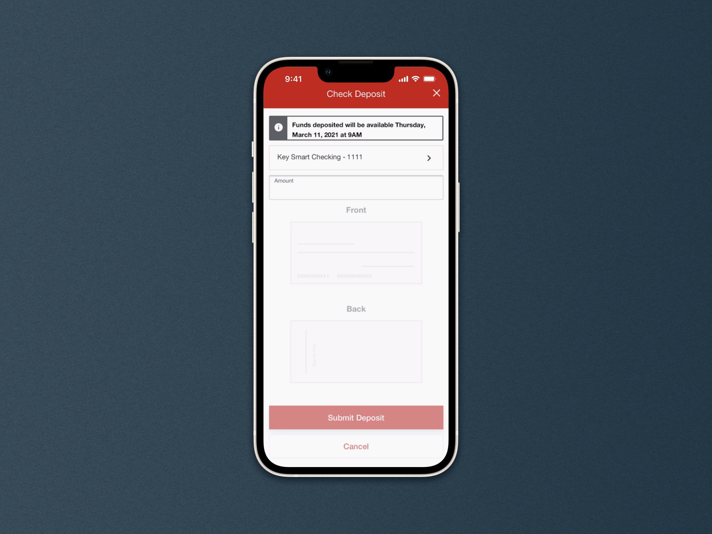
In addition to cleaning up the interface, information about limits and availability were surfaced,
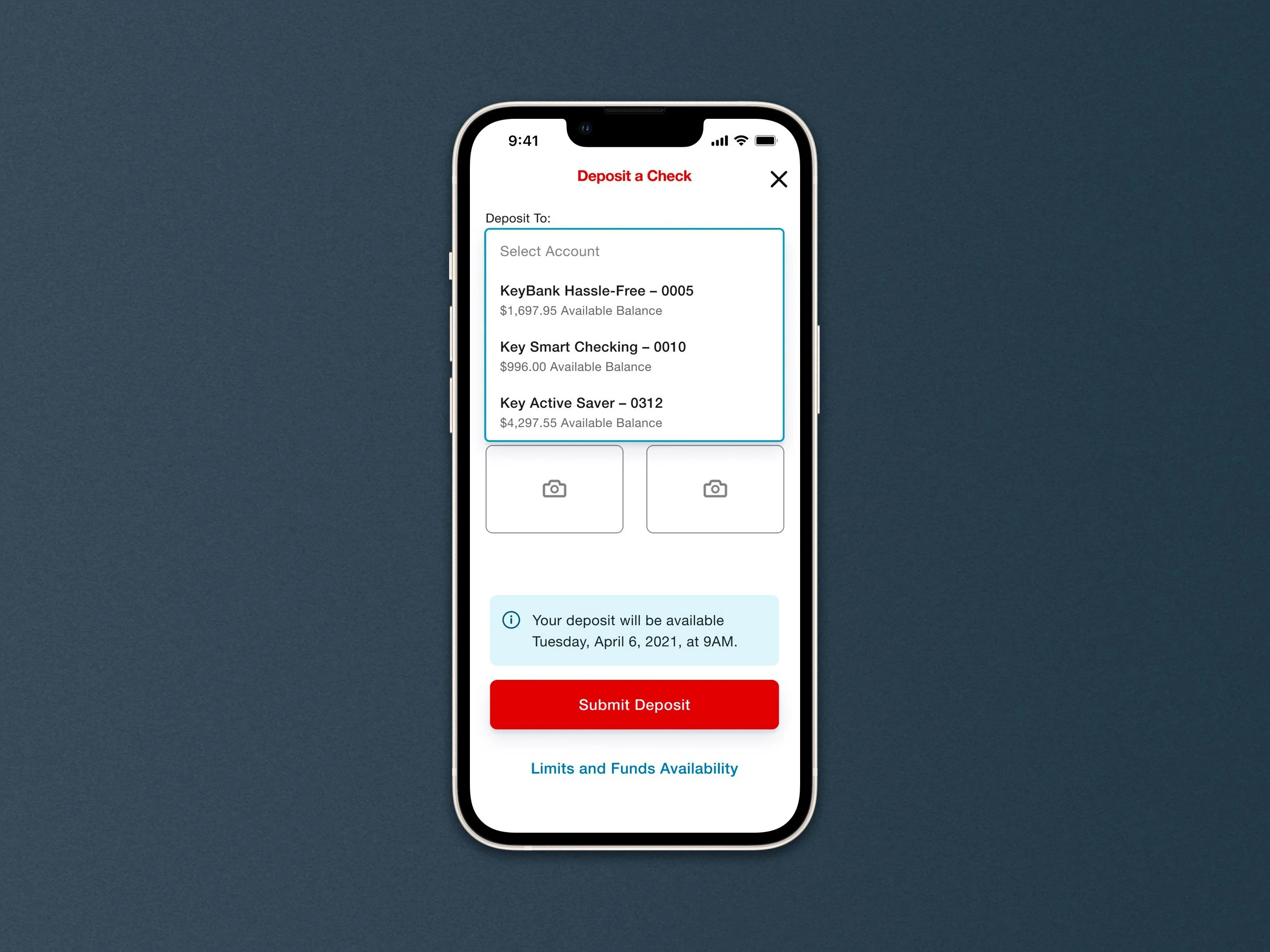
To help users more quickly identify accounts they will now be shown account balances in the selector.
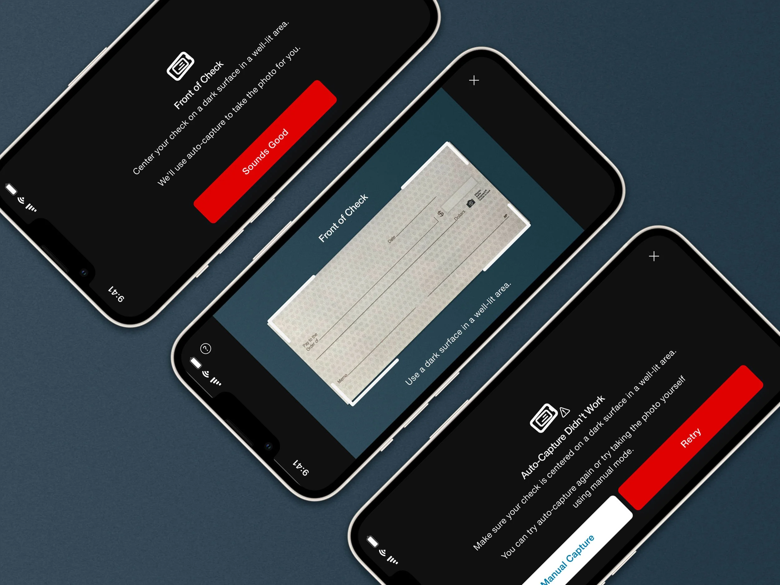
Additional help screens have been added to the the check capture section of the deposit. This will help guide the user through the process and help reduce risk of failure to capture the image. Users are now offered the option to switch to manual capture when auto-capture does not work.
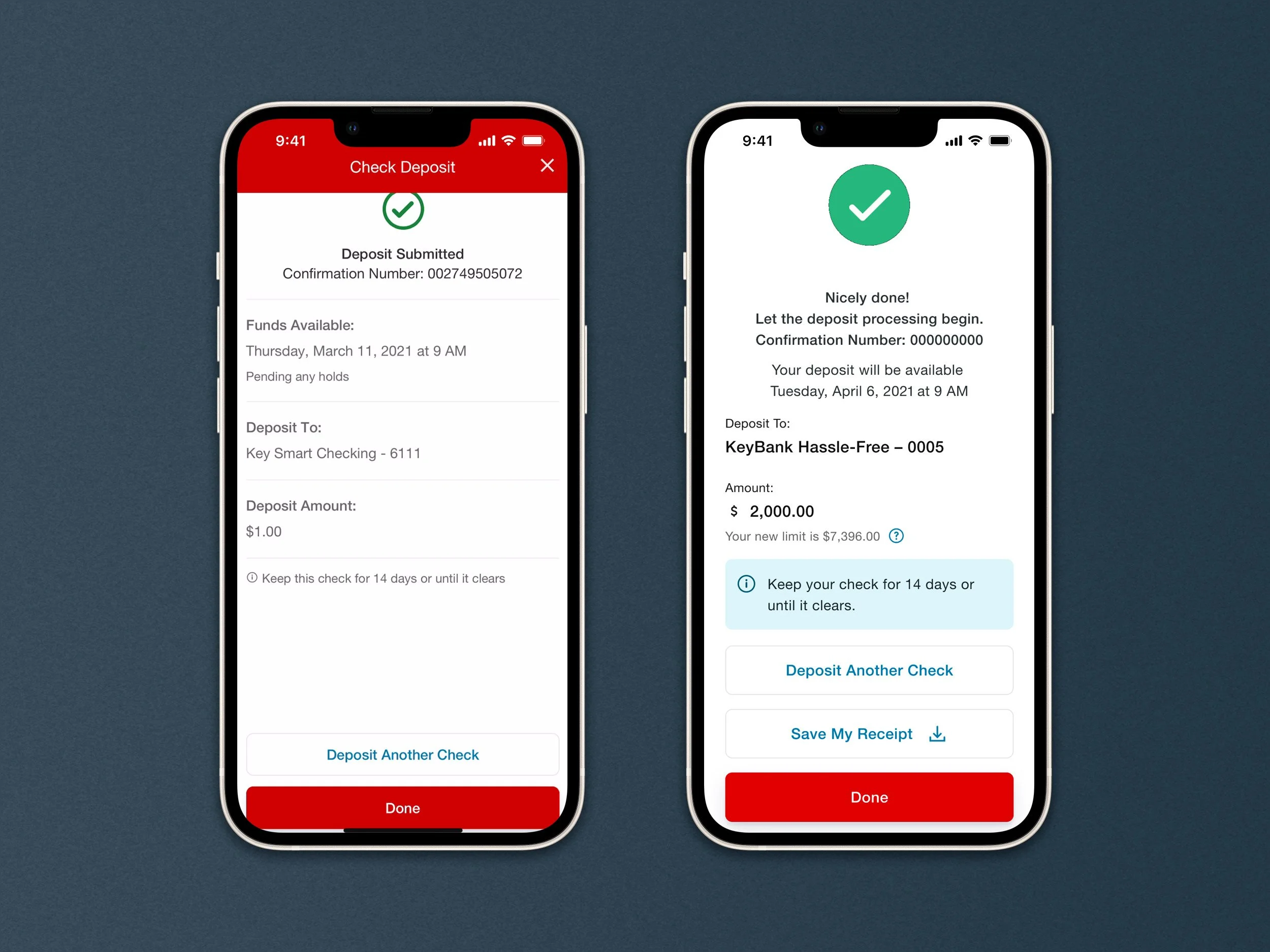
An animation on the confirmation page adds a moment of delight. The option to save their receipt provides the user more confidence that their deposit has gone through.
What’s Next
In addition to updating the experience, deposit limits were increased. After testing with a pilot group, KeyBank launched the new experience to retail and small business customers in March 2022.
Within the first month of release successful deposits have risen 15–16% and the error rate has decreased by ~16%.
Work has also begun on initiating immediate funds to allow the deposit to be available right away.